
With Looker Studio - Newsletter #13


Hello,
It’s been a while since I last wrote to you, and it’s time to get back into a good routine. For 2026, I’ve decided to migrate the “With Looker Studio” newsletter management to Substack: This platform is very practical and perfectly meets my needs, which are, after all, fairly simple...and it’s free, unlike the previous software I was using.
Through a different distribution channel, Substack will also allow me to share posts that aren’t directly related to Looker Studio, but rather to the fields of data and digital analytics in general, or to publish “Notes”.
I’ve created a publication called As we see it now to share these kinds of articles and general thoughts. It’s also a way to compensate for the increasingly limited possibilities on LinkedIn. Consequently, 2026 for me will likely mean less LinkedIn and more Substack.
Enough about Substack, let’s get back to Looker Studio. In this 13th issue of the newsletter, you will find the following content:
A first Looker Studio hack to create text boxes with styles and HTML formatting
A second hack to roll back modern-chart based reports to former charts
The main new features released these last 3 months in Looker Studio
3 just-for-fun shared reports about video clips generated with Gemini, Mirrored line chart ans Superweek 2026 program
Mehdi
Looker Studio Hack
HTML formatting & styles in text boxes
Since the release of Chips and Query Result Variables inside Looker Studio, text formatting in text boxes is based on HTML with hidden tags.
You probably noticed it, copying & pasting texts from Looker Studio text boxes to external text editors carries over those hidden tags. Not convenient.
💡 BUT! The reverse is also true!
You can take this opportunity to improve the formatting and styles of your text boxes with HTML tags and style attribute.
You just need to prepare your HTML code outside of Looker Studio, then copy it in your Looker Studio text box.
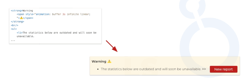
Here an example of warning box with a list and blinking elements, introducing the access to a new report.
To do it, I've used span, strong, br, ul and li HTML tags, with style attributes.
I would not be surprised to see the addition of a rich text editor for text boxes in the future...
PS: This capability is not officially documented, so use this hidden gem with caution.
All the tags and attributes are not allowed. For instance, "style" tags are not allowed and "A" tags are transformed automatically to built-in link components. You need to test if your use case is feasable.
Not perfect but this hack allows some new possibilities of sophistication.
Looker Studio Hack
Rolling back modern-chart based reports to former charts
Here's a little hack about managing charts within a Looker Studio report.
Contrary to what the official documentation says, you can still roll back even if your report already uses modernized charts. The hack is applicable also to a fresh new report.
To do so, simply add an image to your report and right-click on it to use the "Extract theme from image" feature.
It seems that this feature hasn't yet been updated to be compatible with modernized charts, even better, it actually lets you revert reports based on the new chart generation back to the old version. 🥚
Here's how:
Add an image if there isn’t one already
Right-click the image and select "Extract theme from image"
Choose one of the proposed themes
Refresh your browser tab
Next time you open an old report, you will know there is still a fallback solution if you realize that migrating it to modernized charts wasn't such a good idea (...or too much work do it now).
I'm not sure how long this hack will remain valid, maybe this post will even cause its demise 😁, but since the old chart generation is destined to disappear anyway, let's consider this tip as a reassuring way to migrate reports while keeping a backup plan handy for a rollback.
Looker Studio released features
1. New Shape Elements
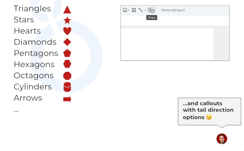
Until today, only circle and rectangle elements were available.
But you can now add the following elements in your report pages, like inside Google Slides:
Triangles, Stars, Hearts, Diamonds, Pentagons, Hexagons, Octagons, Cylinders, Arrows and Callouts with options to customize the position of the tail.
My favourite new shapes are callouts, stars, and diamonds. I'll probably use them the most, avoiding the upload of pictures.
2. Hourly frequency for alerts and scheduled reports (only for Looker Studio Pro users)
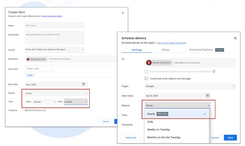
For several years now, Looker Studio Pro has offered a configurable alert system on report charts. Until now, the highest available frequency was daily.
A new preview feature now allows you to create the same alerts on an hourly basis and to define the specific time window during which you want to receive them.
This is yet another reason to consider getting a Looker Studio Pro user license.
Beyond governance and report management capabilities for an organisation already using Google Cloud Platform, you can now add a technical or business monitoring layer with information delivery times, and therefore responsiveness, that will satisfy any functional or marketing team (without relying on observability tools usually handled at lower data engineering layers).
It is also now possible to schedule report deliveries on an hourly frequency.
This update will help address many use cases I encounter. Of course, it only makes sense if your data warehouse or analytics tool is capable of providing fresh data on an hourly basis as well, and not with a five hour delay...I am sure you can guess which solution I am referring to (sorry, I like bashing it for 6 years 😁).
3. Component visibility control in report view mode
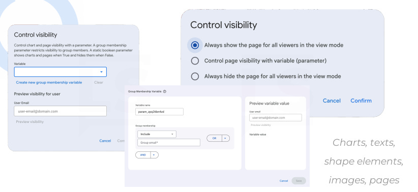
It is now possible to hide a page element or an entire page based on the value of a variable or the configuration of a 'group membership variable':
Group membership variables: This is a feature that links a component's visibility in view mode to a Google Group or email address. This use case is directly related to organization data governance, so it is natural that Looker Studio offers it exclusively to Pro users.
Variables: Using variables to trigger the visibility of an element or a page in view mode is available to everyone. Excited about this feature and what it allows.
4. Overriding field id to filter across data sources
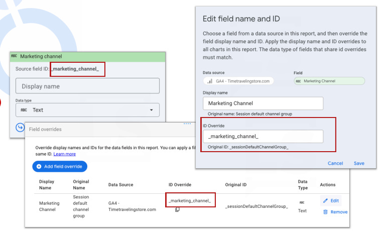
This feature highlights one of Looker Studio's long standing but lesser known capabilities: filtering across different data sources that share common field IDs and are populated with the same values.
With this addition, you can specifically declare this override within the interface and configure filter controls that will impact all data sources sharing the same field ID. The documentation notes a few limitations, though they are quite logical, The main one: any change to an ID will require an update to all instances where that field is used, as the override ID replaces the original one.
Until now, it was possible to achieve the same result by creating calculated fields sharing the same IDs across each data source. For now, let's consider this feature as a way to make an existing capability more explicit.
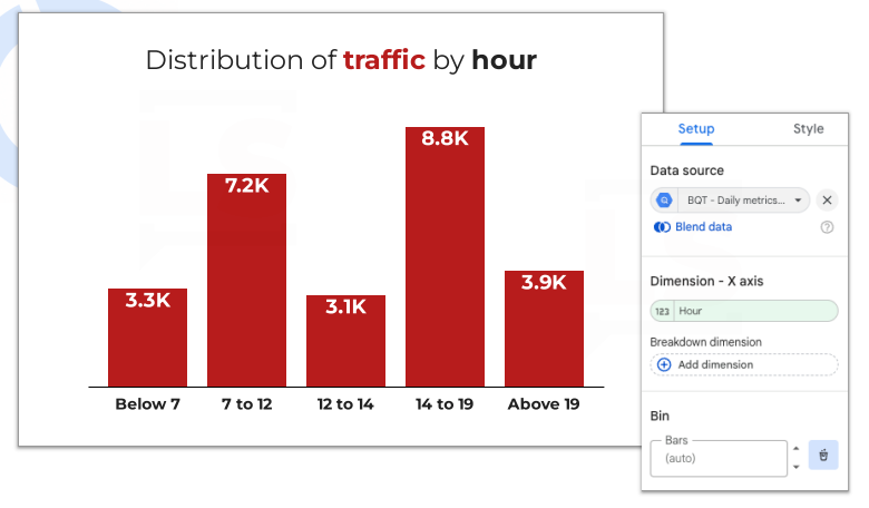
5. New chart type: The Histogram
To put it simply, this is a version of the bar chart that allows you to include bins directly within the chart configuration. This makes it easy to group numerical values and aggregate their distribution.
I don't personally have a use for it, making usually the same with data preparation outside of Looker Studio or using simple dimensions...but why not...
Just-for-fun Shared reports
Insight video clips with Gemini 3 for your standalone data story telling

A few months ago I created a just-for-fun report that displays product ranking data and track the associated volatility. At that time I created two characters, Don Hutchart and Anna Lyz, whose role was to dynamically comment on the interactive report.
Here the next level with the generation of video clips thanks to genAI for a standalone data story telling.
Read the article and watch the videos to discover the results of this very funny experimentation based on Gemini Veo 3.
Mirrored line chart Vs 100% Stacked Area Chart with Looker Studio

I’m not a big fan of mirrored line charts and that’s putting it mildly. So, in this article, I decided to revisit one of the example I found in an article about AI.
Superweek 2026 - The International Analytics conference

As I do every year ahead of Superweek Analytics Summit, I rolled out a new version of my shared Looker Studio report, shared and available through this blog post.